
The Project:
Design the look and feel of our Virtual Assistant natively in the Android app based on the functionality of the iOS app.
Time frame: 3 months
My role:
Project Manager, UI/Interaction Designer
Interaction Work:
I had been assigned to the tail end of the iOS rollout of the virtual assistant, so I was already familiar with how it worked. I couldn’t really change the functionality, but we could change the look and feel to make improvements in the usability of the app.
The constraints/requirements for the project were:
It had to feel like native material design.
It had to have the “Kate” branding.
It had to have a horizontal view (iOS was locked in vertical view)
It had to be capable of voice input, but not for day one (it had to be flexible).

Kate Branding Icon

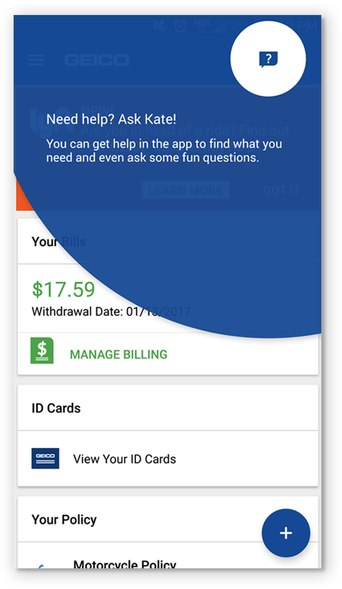
iOS Virtual Assistant Home Page

iOS Virtual Assistant Answer
Inspiration:
I used the material design kit as most of my inspiration. Our Android app was designed to be as native as possible.
Wireframes:
I wireframed out the flow based on the iOS functionality as well as what I was familiar with for the Material design kit. It was at this point that I started attending the daily scrum calls with the developers for this project. This was a key part of our success and it was one of the smoothest projects I had worked on because of attending the meetings.
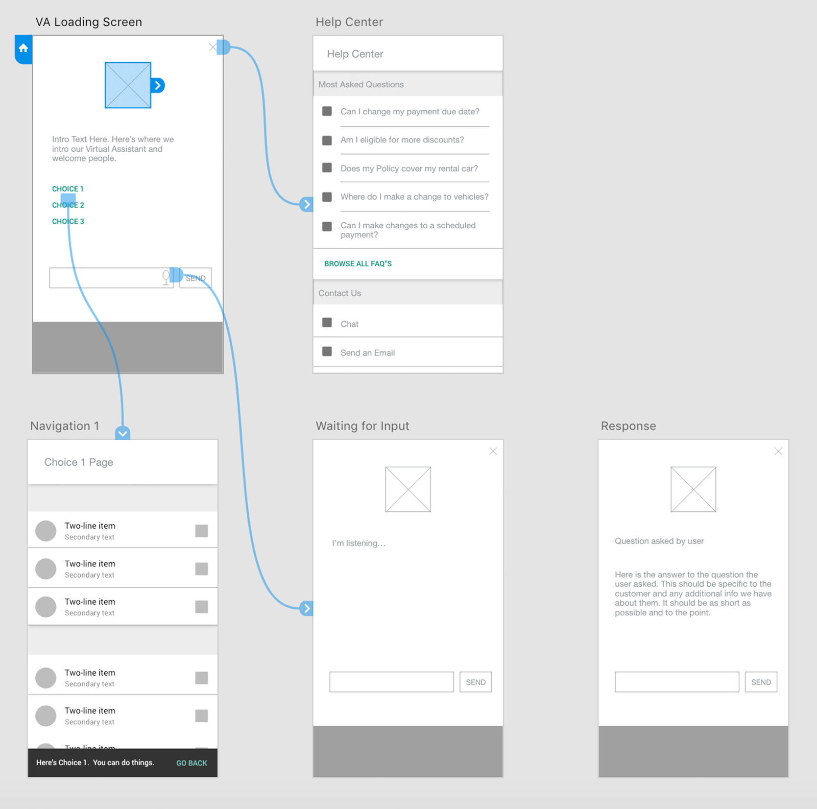
Wireframed flow created in Adobe XD
UI design:
Once the wireframes were hammered out, it was an easy jump to the high-fidelity mockups. I shared my progress with the developers on a daily basis, so they were able to jump right into the coding part as they had free time. What really helped in these sessions is that the developers would ask interaction questions that I hadn’t considered as part of the design (i.e. what happens if they tap the microphone again while the system was talking). I was able to take their questions, discuss it with fellow UX/UI designers and bring an answer back the next day.
Changed design to Material Colors
Used native button styling
Based on an overlay design
Included branding for virtual assistant


Hierarchy : Wanted to show question and answer while still feel like Android

Snackbar : Used to tell the user where the virtual assistant navigated them and offer a way back.
Feature Discovery : Used to tell our users about the virtual assistant and why they might be interested in it

The full set of mockups, including some options around the feature discovery component.